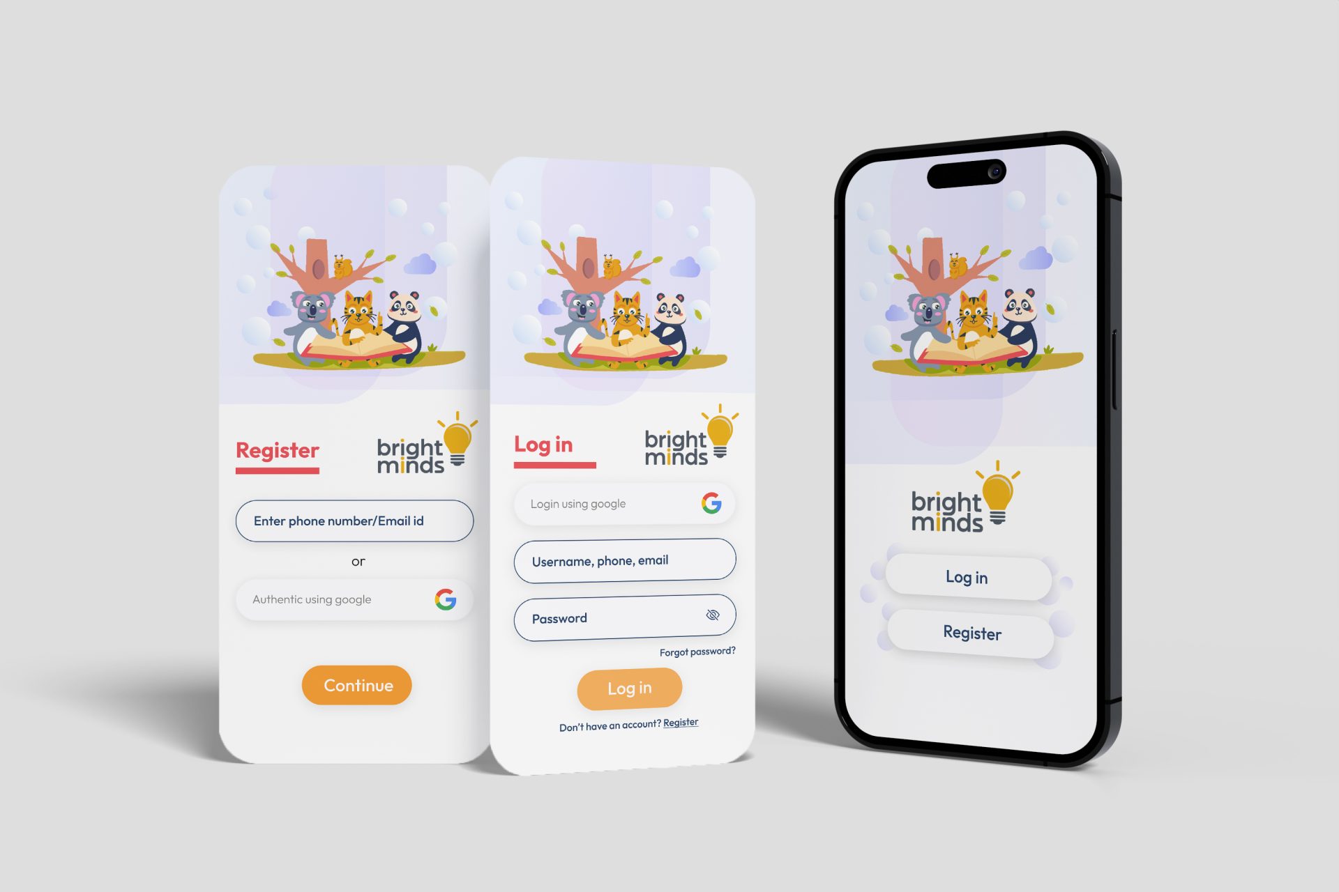
Dyslexia and Dyscalculia Child App
Transforming Learning for Kids with Dyslexia Through Engaging UI/UX
Client Overview
Our client – Bright Minds, an EdTech startup, sought to create an interactive learning application tailored specifically for children with dyslexia. Their goal was to make reading enjoyable and accessible, supporting parents, children, psychologists and educators with a tool that was as functional as it was engaging.
Challenge
The primary challenge was to design a UI/UX experience that catered to the unique needs of children with dyslexia and dyscalculia, ensuring it was simple, intuitive, and visually engaging. Traditional design approaches wouldn’t be enough; we needed a solution that would reduce cognitive load, maintain engagement, and support learning retention for kids who often feel frustrated by conventional educational methods.
Solution
Our team embraced a research-driven approach, involving educators, specialists, and—most importantly—the children themselves to understand the nuances of friendly design. We focused on implementing high-contrast colours, readable fonts, and interactive touchpoints to keep engagement levels high without overwhelming users. Key features included:
- Customized Font Selection: Fonts were chosen specifically for dyslexic readability, ensuring children could engage without strain.
- Gamified Learning Elements: We introduced game-like elements that made learning fun, rewarding small achievements to build confidence.
- Guided Visuals & Audio Prompts: Each step was accompanied by visuals and audio, making the app self-navigable and helping kids stay on track.
Results
The app trial was launched to an overwhelmingly positive response. Teachers and parents reported a noticeable improvement in the children’s reading confidence and engagement levels. Within the first six months, the app saw a 97% retention rate, with daily active users spending an average of 30 minutes on the app—a testament to the engaging experience we created.
Conclusion
Our commitment to empathy-driven design led to a solution that truly resonated with the end-users. By deeply understanding our client’s goals and the needs of dyslexic learners, we delivered an app that wasn’t just functional but transformative. This case reminds us that effective design is about creating solutions that feel natural, supportive, and empowering.


